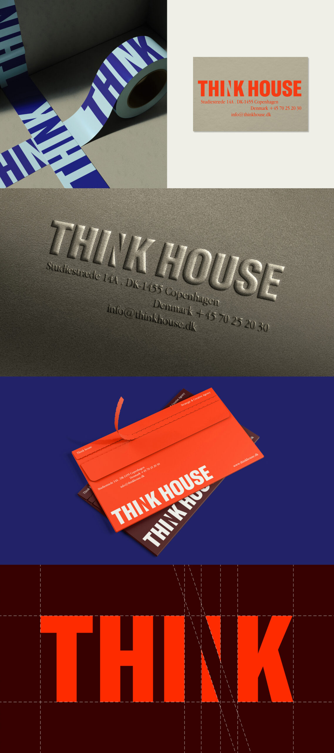
Think House
Think House is an agency that specializes in activating people and brands through meaningful, engaging experiences. At the core of the identity is a simple idea:
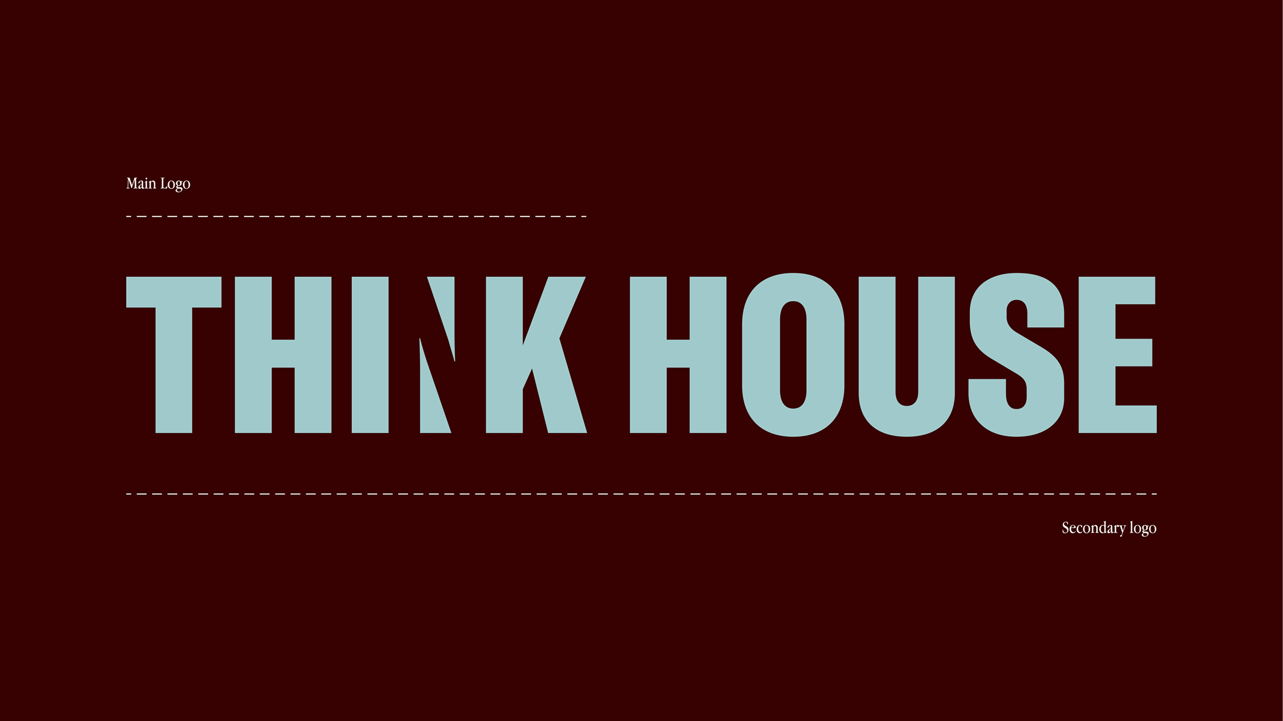
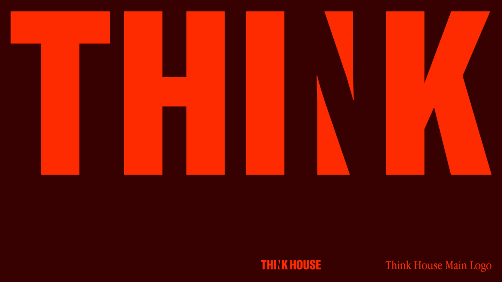
sometimes, the most e!ective concepts are the ones that just fit. The brief for the logo was to create something that would make you pause and think—something subtle, yet memorable. By playing with the inverted “N,” we introduced a small visual twist that delivers that extra “aha” moment, reinforcing the name and the philosophy behind it.
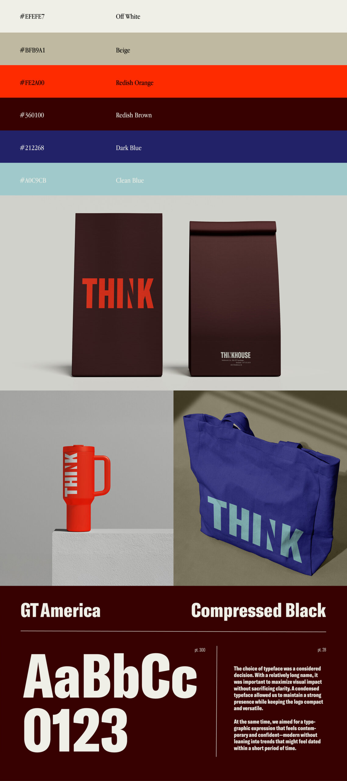
The choice of typeface was a considered decision. With a relatively long name, it was important to maximize visual impact without sacrificing clarity. A condensed typeface allowed us to maintain a strong presence while keeping the logo compact and versatile. At the same time, we aimed for a typographic expression that feels contemporary and confident—modern without leaning into trends that might feel dated within a short period of time.
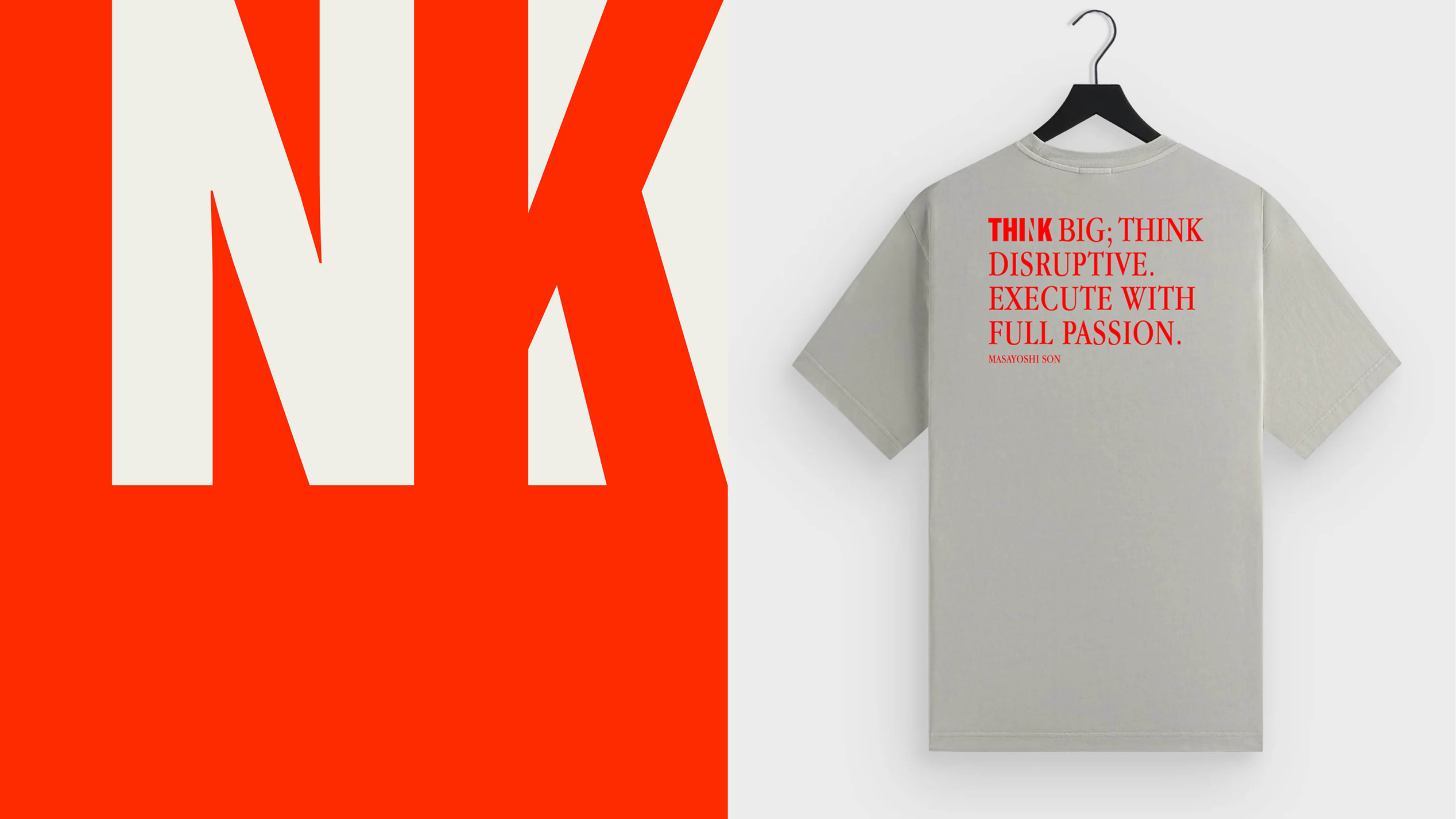
The color palette was developed to stand out rather than blend in. We worked with tones that feel bold and expressive, combining them in a way that feels slightly unexpected instead of safe or predictable. This deliberate sense of imbalance adds character and energy, reflecting Think House’s approach to creativity: thoughtful,
distinctive, and unafraid to challenge what feels familiar.