Flatlist | Identity
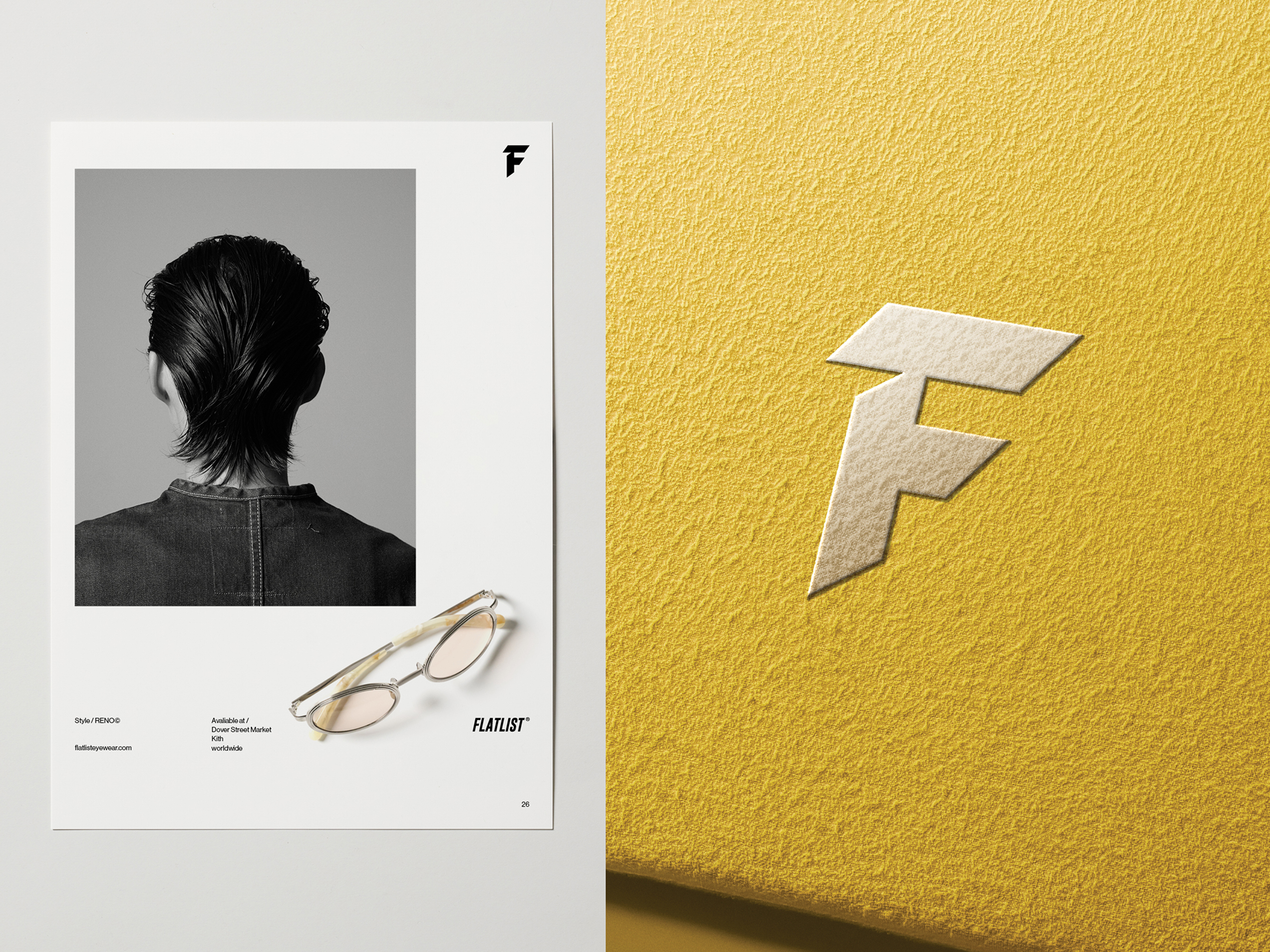
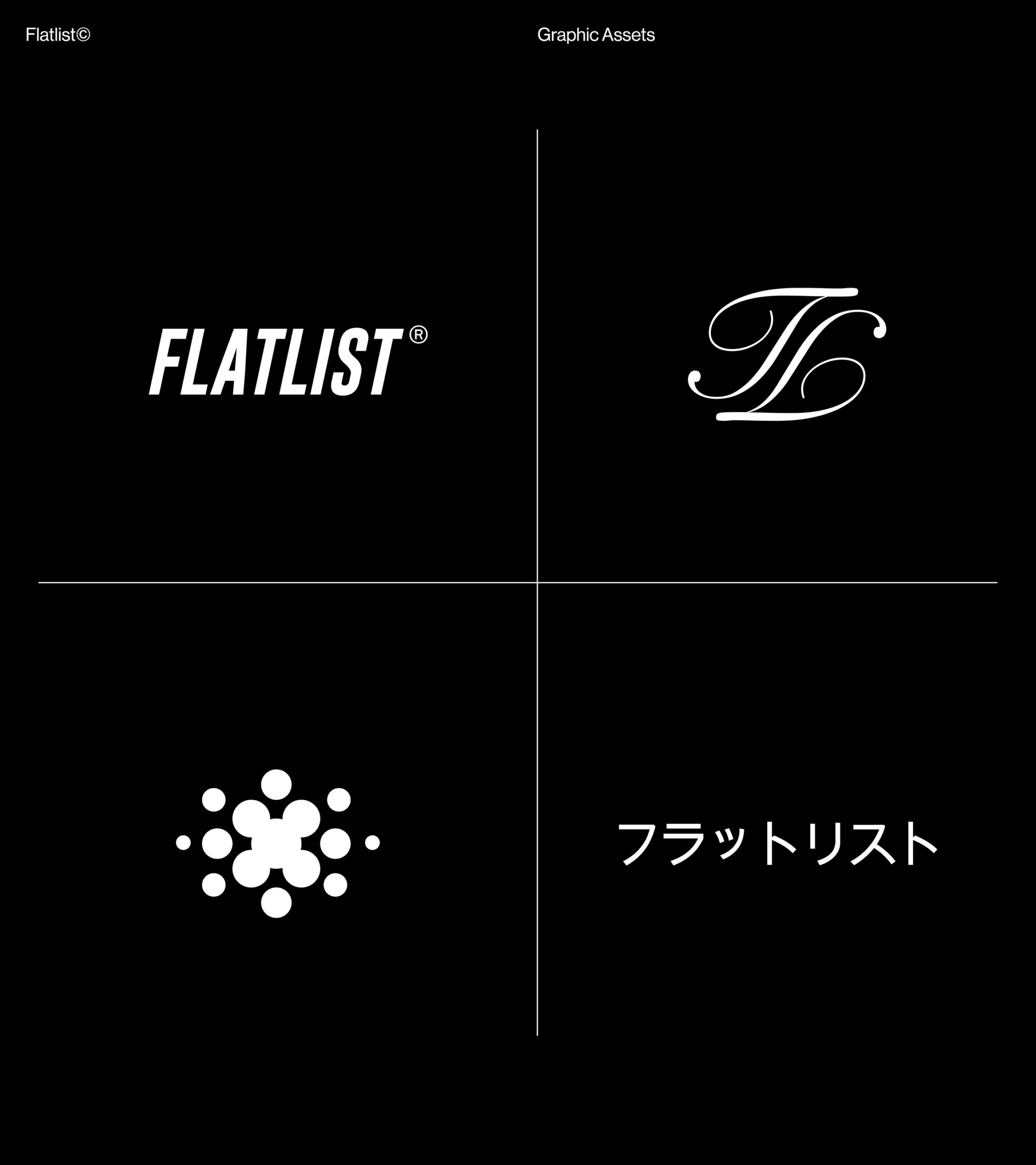
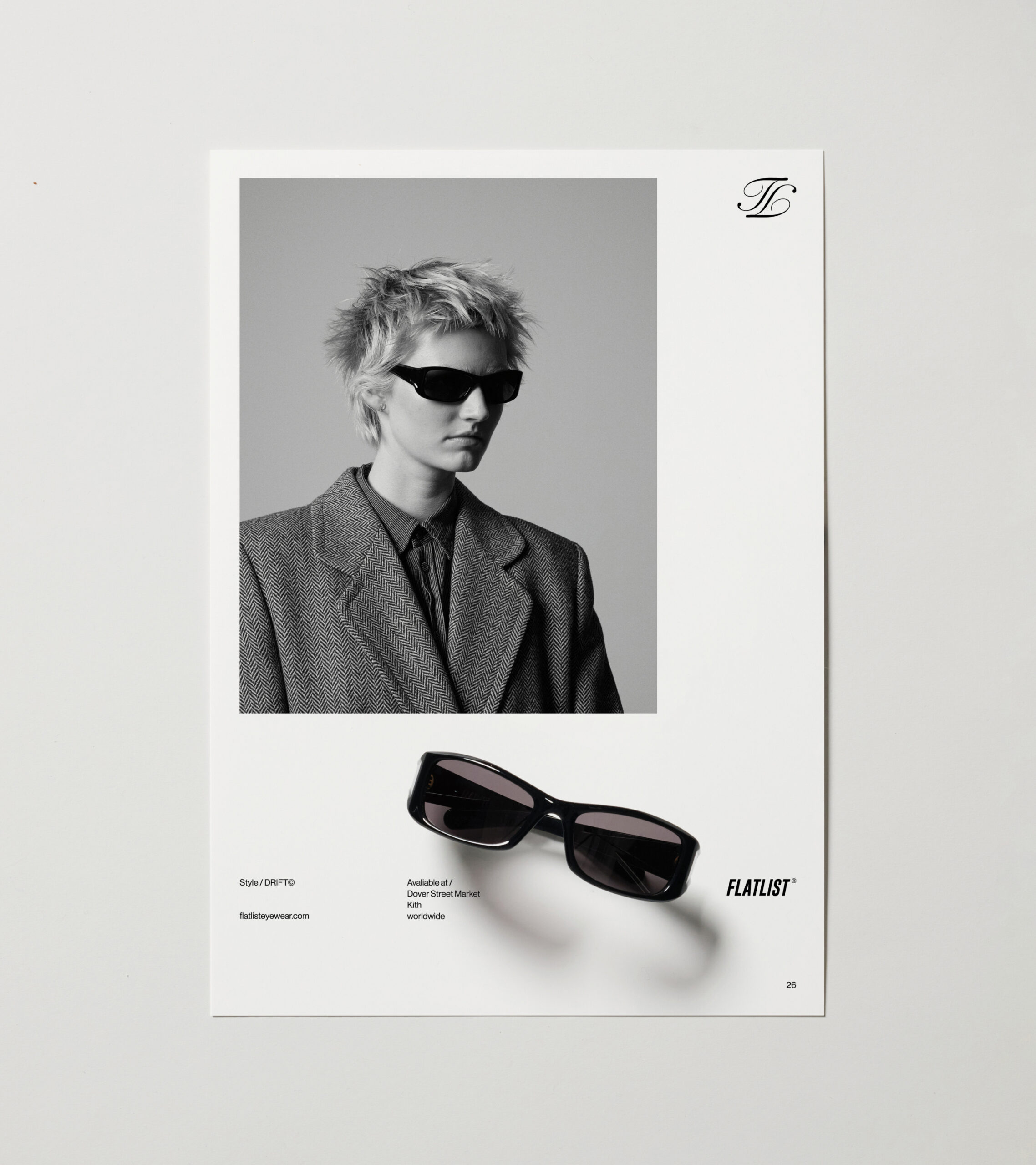
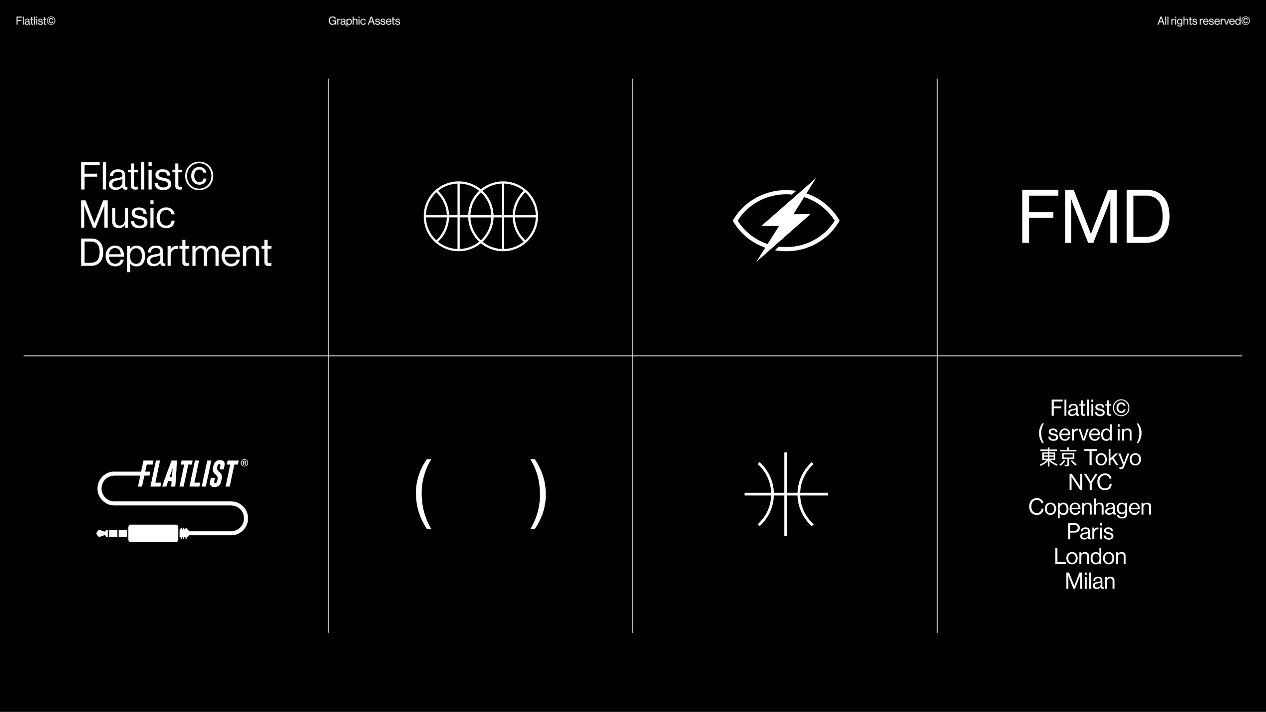
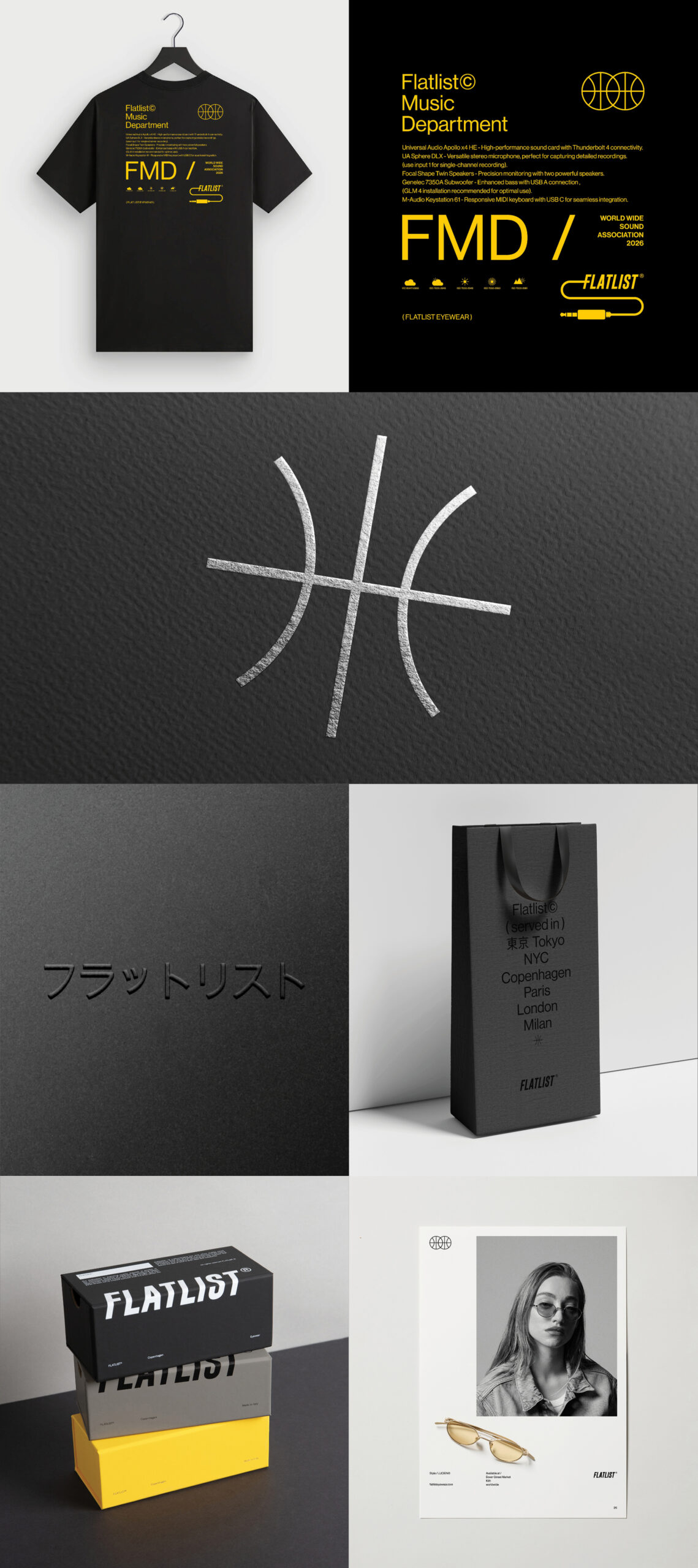
The Flatlist identity is more than a single logo or a fixed typeface. It is a flexible visual system built from a series of graphic assets that can be used seamlessly across multiple platforms, while still being strong enough to stand on their own. This identity represents where Flatlist is right now, but it is not static, it is designed to evolve, adapt, and grow over time as the brand continues to develop.
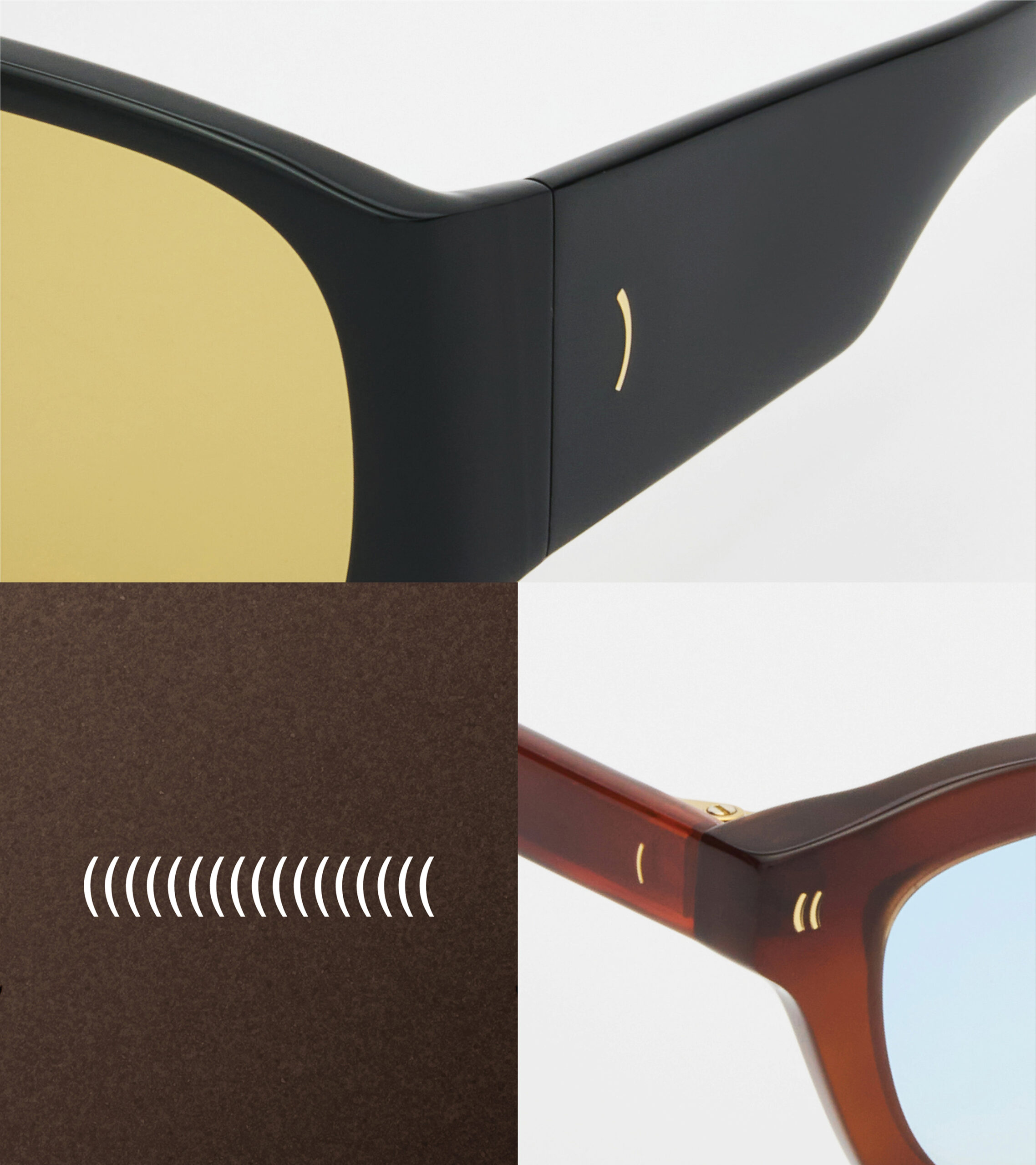
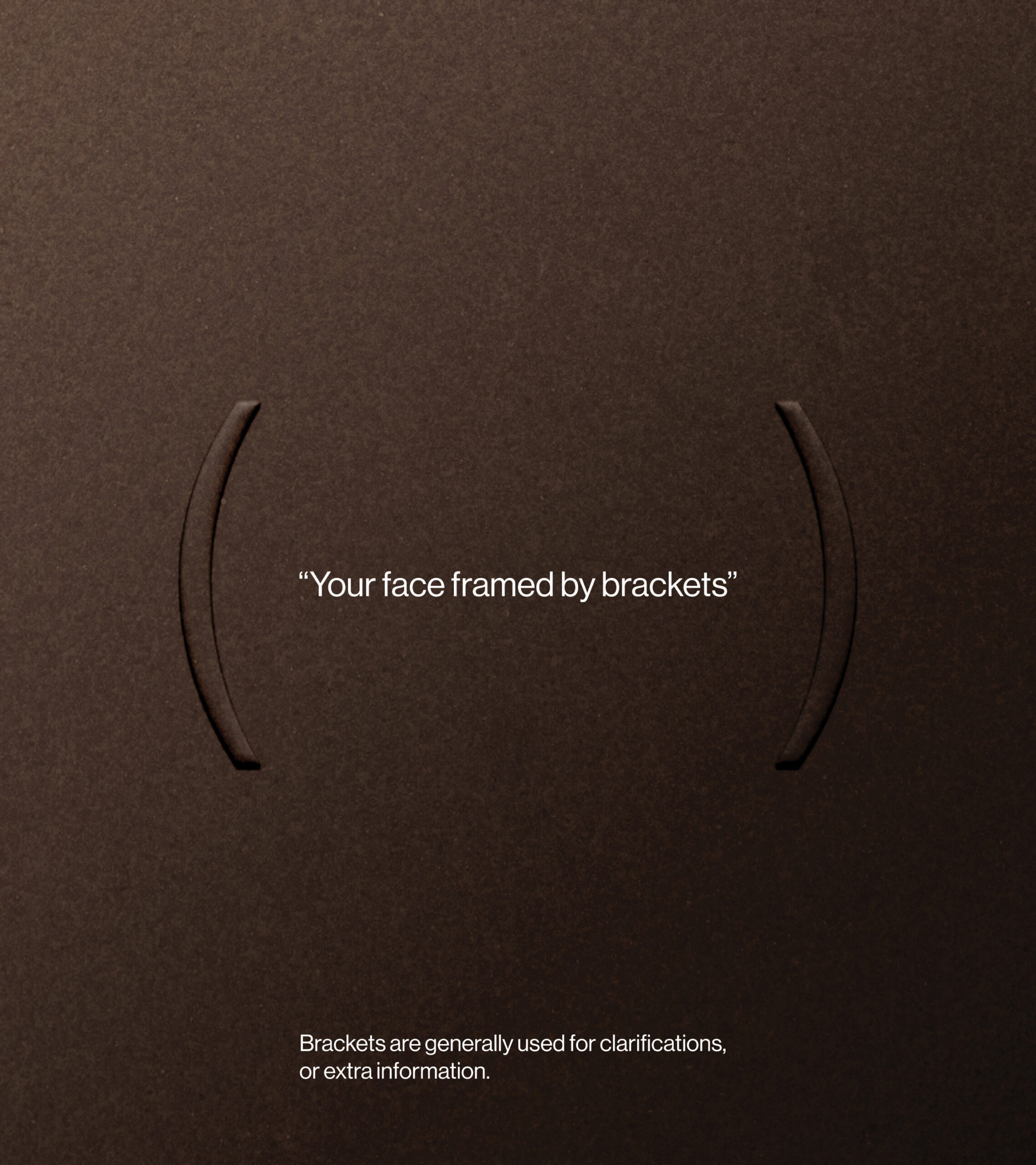
One of the core elements that will remain part of the Flatlist identity going forward is the use of brackets. We are continuously building new graphic expressions around this element to push it further and explore its full potential. The brackets frame the face, highlight individuality, and turn something familiar into something distinctive. In the same way that brackets make a word or phrase stand out in text, they make you stand out. This idea of emphasis, focus, and individuality sits at the very heart of Flatlist.
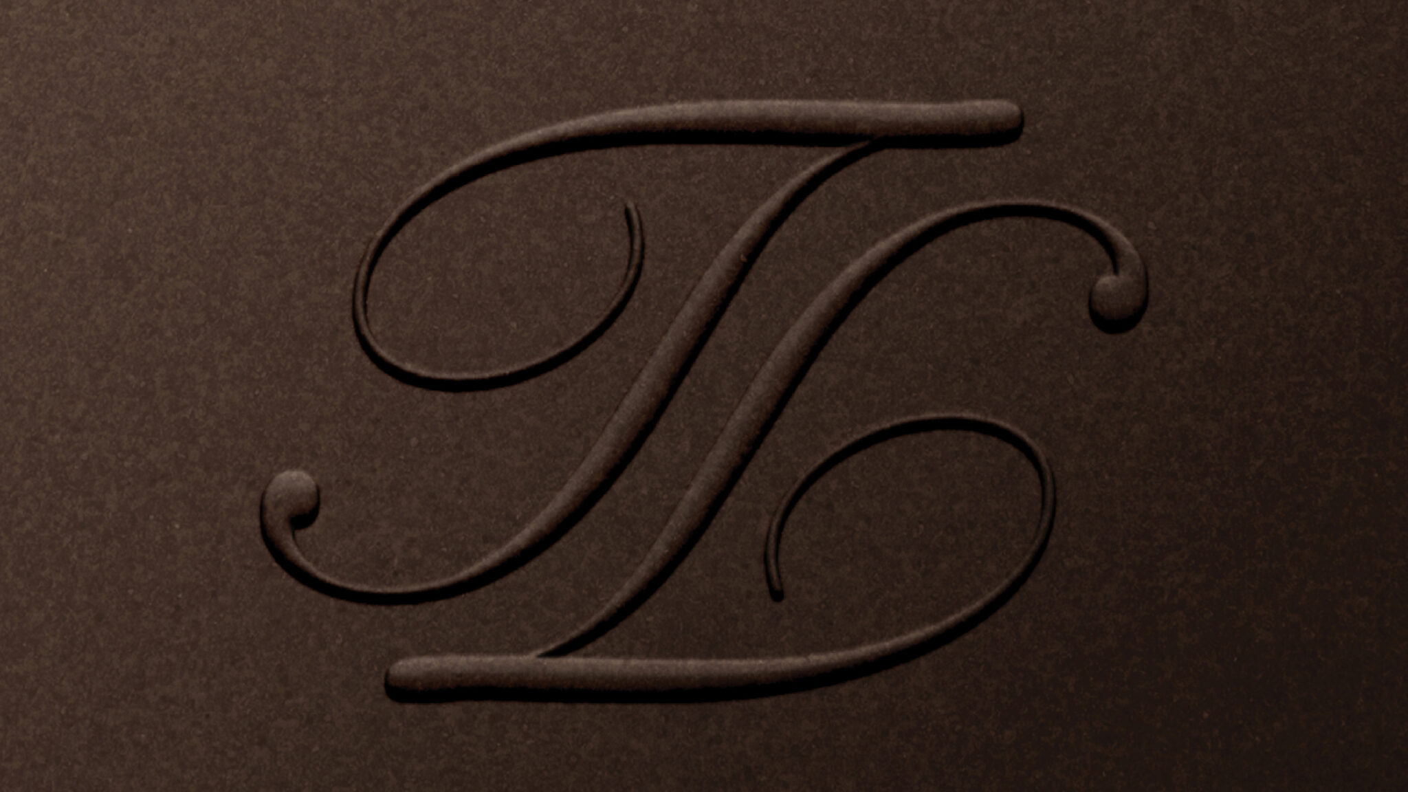
Typographically, the identity embraces contrast and experimentation. We mix different type styles, ranging from gothic and brush lettering to classic Swiss inspired aesthetics. There are no rigid rules tied to specific fonts, only one guiding principle: it has to feel like Flatlist. This openness allows the visual language to stay expressive, bold, and true to the brand’s personality, while still leaving room for future exploration and refinement.