Ryding Works
Ryding Works specialises in interior design and bespoke furniture, so when given the opportunity to create its visual identity, it was essential that the brand reflected
the same sense of quality, craftsmanship, and attention to detail found in their interior work. The identity needed to feel considered, refined, and timeless—much
like the spaces and furniture Ryding Works creates.
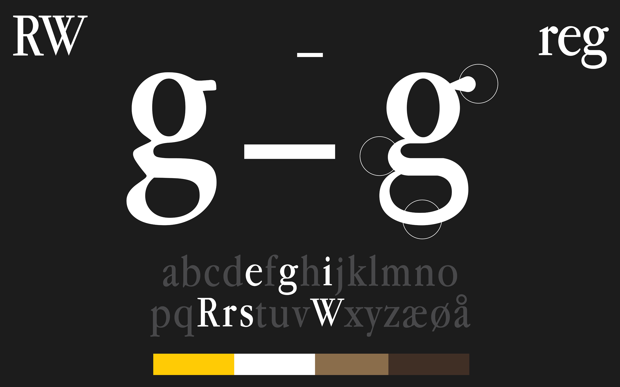
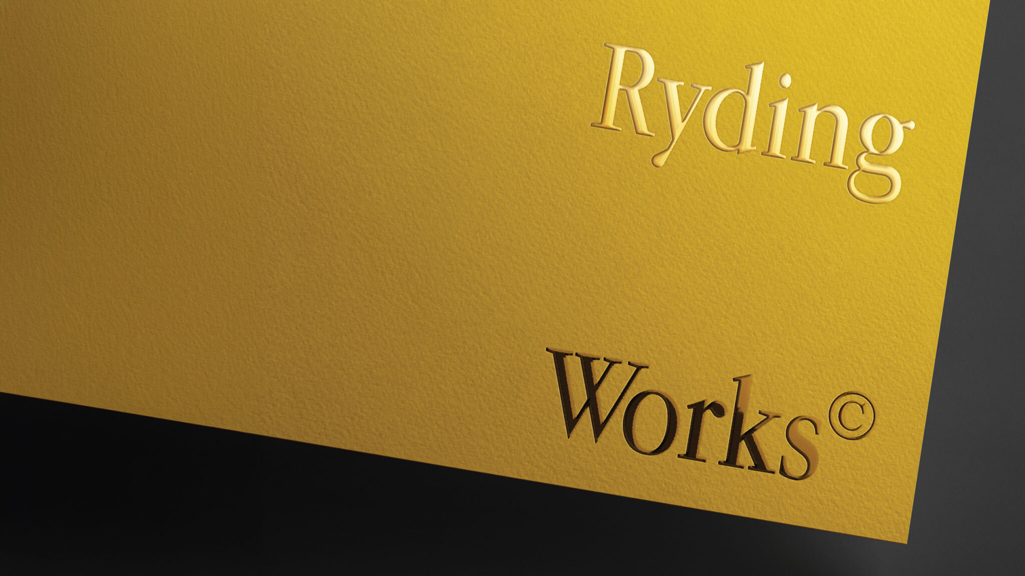
To achieve this, we chose to reinterpret the Apple Garamond typeface, remaking it in a new, cleaner, and more minimalistic form. This updated version maintains the
elegance and heritage of the original while aligning with a contemporary aesthetic that feels both modern and understated.
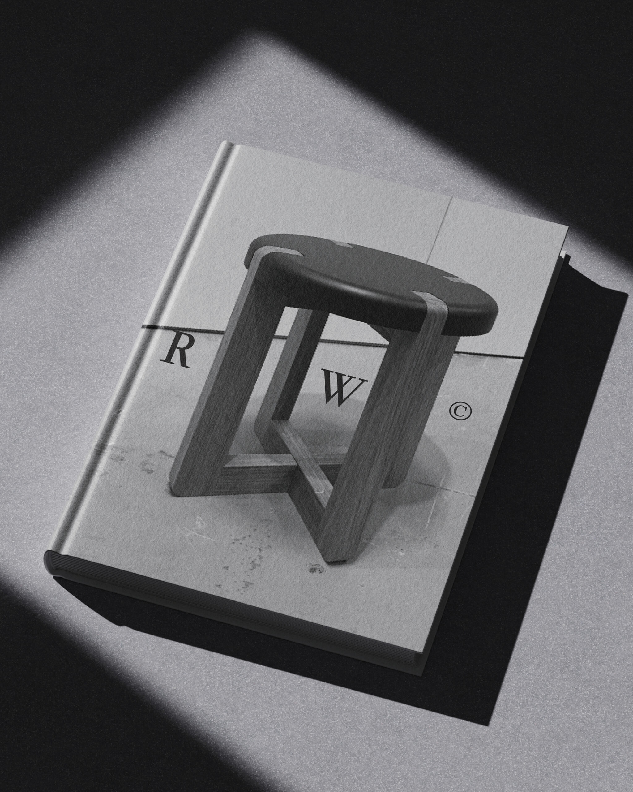
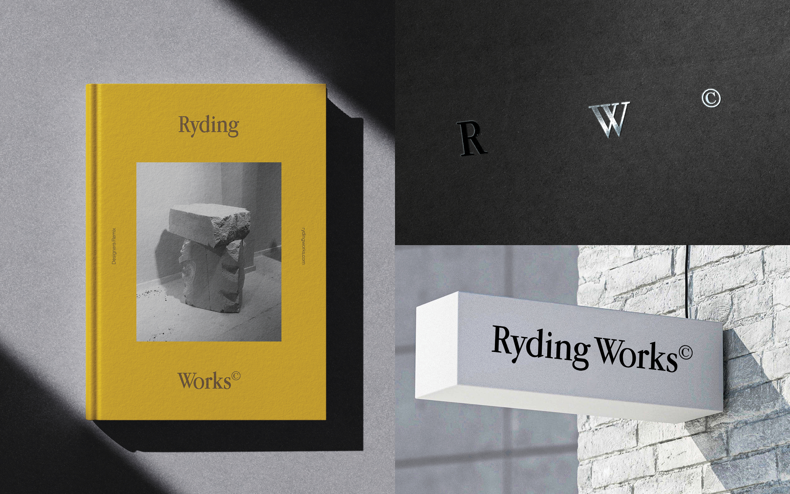
The logo system is designed to be flexible, with multiple versions to suit di!erent formats and applications. Alongside the full wordmark, a simplified monogram version using only the initials “R” and “W” was developed, o!ering a modern and confident alternative for smaller or more minimal uses.
The colour palette is inspired by a deep appreciation for interior spaces and materials. Warm brown tones reference natural wood and fine craftsmanship, while
gold and brass accents celebrate the beauty of metal surfaces, adding a sense of richness, warmth, and subtle luxury to the overall identity.